I just thought I'd do a quick walkthrough of the poster I did for the LightGreyArtLabs Station Zero show.
If this is all news to you,
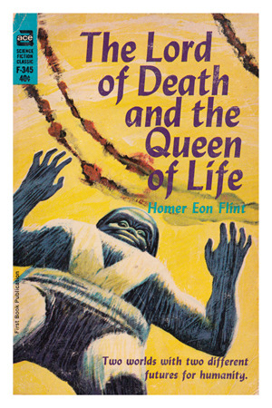
read THIS first.
Reading Homer Eon Flints book was a strange experience. On a
purely critical level, it's not very good because the writing just isn't very
compelling. However, knowing it was written in 1919 makes reading it
quite interesting. My favourite moments being a brief reference to new-fangled military "tanks" and one of the astronauts dropping a book and a piece of paper on a planet with no atmosphere and watching them hit the ground
at the same time.
Anyway, here be spoilers.
The Lord of Death and The Queen of Life are two short stories featuring the same human characters.
The
first story begins with four Earthlings en route to Mercury.
(Enjoyably, in the manner of something like Langs "Frau im Mond" or the
Méliès' "Le voyage dans la Lune", the craft seems to have been built by a
handful of enthusiastic scientists and engineers in a garage.) The craft moves by
the power of magnetism. In the way that two magnets of opposite polarity
repel each other, the idea here is that the ship generates magnetic
energy of one polarity and 'points it' at the earths pole of the
opposite polarity. Thus, the earth repels the spacecraft. All the way to
Mercury.
Mercurys day is as long as its year (in this book). Therefore,
constantly with the same aspect toward the sun, one hemisphere would be
unbearably hot and the other inhospitably cold. So, life could only
exist along the thin line where the hemispheres meet. ....remember that.
At this point, I was starting to wonder where the hell this "Lord of Death"
was and whether or not the cover (by Jack Gaughan) was even relevant to
the story.
The crew land on Mercury, in a long-since deserted city. A
city which thrived when Mercury was as far from the sun as the Earth is
now. They discover a chamber containing (FINALLY!) a big ugly monster,
which is long dead but preserved in a sort of glass jar. They discover
some audio tape which, when translated, reveals itself to be the
autobiography of this once great ruler of Mercury. At this point, the
book diverges from the humans and just tells the life story of this
Genghis-like warlord. I'm skipping all that because it's boring. In the end, after much
consternation, the vainglorious "STROKOR" uses a weapon he invented to
destroy all life on Mercury so that he would never be usurped or have to
pass on his leadership to another generation. The weapon was
essentially a massive wire running from the North Pole to the South with
a gap in the middle. At the critical moment, a piece of metal was
dropped into this gap, completing the connection and making a sort of
short circuit out of the whole planet which killed everybody. By that
point, Strokor had sealed himself in this jar so that he would be the
only one alive and could just sit there calmly awaiting death.
So, with the first story out of the way, it was time to start
drawing. The main thing on my mind was the concept of polarity which
came up so often, and also hemispheres, triangles (Mercurian
architecture is all about prisms) and this Strokor character.
To begin with, some little mostly magnet-based doodles..

Then,
some illustration, focussing mostly on the humans and their arrival on
Mercury. I don't usually do this kind of thing so I had to force myself
to remember the text and think of it as a compositional element..

Next, I started sketching with more symbolic imagery. Circles and
triangles, mostly. I also started working with the idea of the titular
lord of death but I quickly got bored and went back to the humans..

This
is where the final idea started showing up. The magnetic fields from
earlier, the orbits and hemispheres, and the spaceman started coming
together into one image that I was happy enough with..
Then I started reading again.
"The Queen of Life" opens with a
SHOCKING revelation. We find out that, all this time, one of the four
human men was actually a woman! Great stuff. In the first story,
Jackson, the architect, proved to be the equal of any of the other
three. Flint then states "Ambitious and ingenious, with a natural liking
for house-planning, she
had resolved that her sex should not stand in the way of success."
...ok... Odd little mention of the "natural liking for house-planning" but
still, it's 1919 and there's a woman baffling perception and proving
that the weaker sex is anything but.
So, the other three men (I thought it would've been exciting for
all of them to reveal themselves as women hitherto passing as men, but
sadly no such luck) obviously change their behaviour toward Jackson who,
at one point, states that she's happy to remain in the uniform she's
been wearing, rather than into something more feminine now that her
secret's out. Sadly, here the wheels slightly come off the authors wagon. Flint was doing
so well until one of the crew, who had also served as the cook up to
this point, goes to make dinner. Jackson, now publicly and unashamedly a woman, takes
the opportunity to show him how to cook an omelette properly. I suppose
women are naturally good at that too. If you're interested, the book is
online for free at project Gutenberg so you can read this little section
if you click
this link and do a search for the phrase "speaking of Venus".
So, back to drawings, and this spectacular twist gave me all I needed to finish the last sketch I'd done..

I carried on reading but it was all pretty boring and I knew I'd found the image I wanted to paint.
Incidentally, Flint uses some slightly troublesome racial
terminology to describe Strokor in the first story and then, in the
second story, when the crew meet a Venusian he says "His nose was quite
small, with a decidedly Irish cast" ....what? Can anyone explain what
our noses look like that's so noteworthy?
Anyway, here's how the rest came together:
Time for those pesky perfect circles..
Once that was done, it was time to scan. I wasn't sure if I was going to go for a heavily textured battered and bruised look so I kept the painting clean and scanned in some textures seperately. Using perfect circles also made it easy to digitally flip the orbits in front of each face.
when I was finished doing all the texturey business, duplicating the circles for better contrast and overlaying the text, I turned off the painting underneath which revealed this pretty cool-looking image.
The font I first thought of using was Eurostile but I wanted to use an open-source font so I found a few options. The one I really liked was "Orbitron".
So that's it!
You can buy
a print of this poster, and see the other excellent posters, in the
Light Grey Art Labs print shop and
read a bit about the show on their blog.
Such a cool thing to be a part of. I've recently finished another painting for their "Role Models" show but hopefully it won't be the end of my LGAL work.